


Recognize the Brand and it's Taste and Act accordingly
How to Think of a Great Design
Set your Agenda - what you exactly want
Think about what your Brand Connects with
Get an Idea about What Competitors are doing and get some Inspiration
factors to consider
Colours
Fonts
Images
Illustrations
Alignment
Colours
Colours should be pleasant on the eyes - like Flats but not Solids
Avoid using too many colours in your design - create a 3/4 colour pallet for that brand
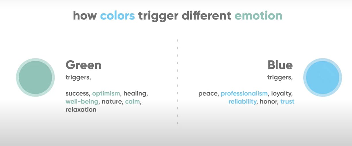
Use those colours that convey the correct emotions and content of that brand
Fonts
Should Correlate to the kind of message shared by the brand
Images
Images are Quintessential for a great design, these convey more than images to the user in a single look
Some places to refer to are:
Illustrations
Use Appropriate illustrations to convey the depict the brand. like the people/ places/ professions/ things etc
These should also follow the colour pallet/ theme decided
A minor touch of animation would help enhance the user experience. if possible the animations should be subtle and practical to everyday life.
Alignment
proper allignment of the pieces including text and images in all the views and Responsive in major devices of the TAM
Overall, a mixture of many tiny things Contributes to an impressive, Attractive and impact webpage. However, the Quality of the Content paves more Credibility to the Site, which in turn brings people repeatedly.
Thank you,